
Case Study · Superfoods - Organic Ube Powder
Ube Bae
Turning a vibrant superfood into a clear, inspiring shopping experience.
We connected product education, recipe inspiration, and a focused purchase path within one responsive storefront.
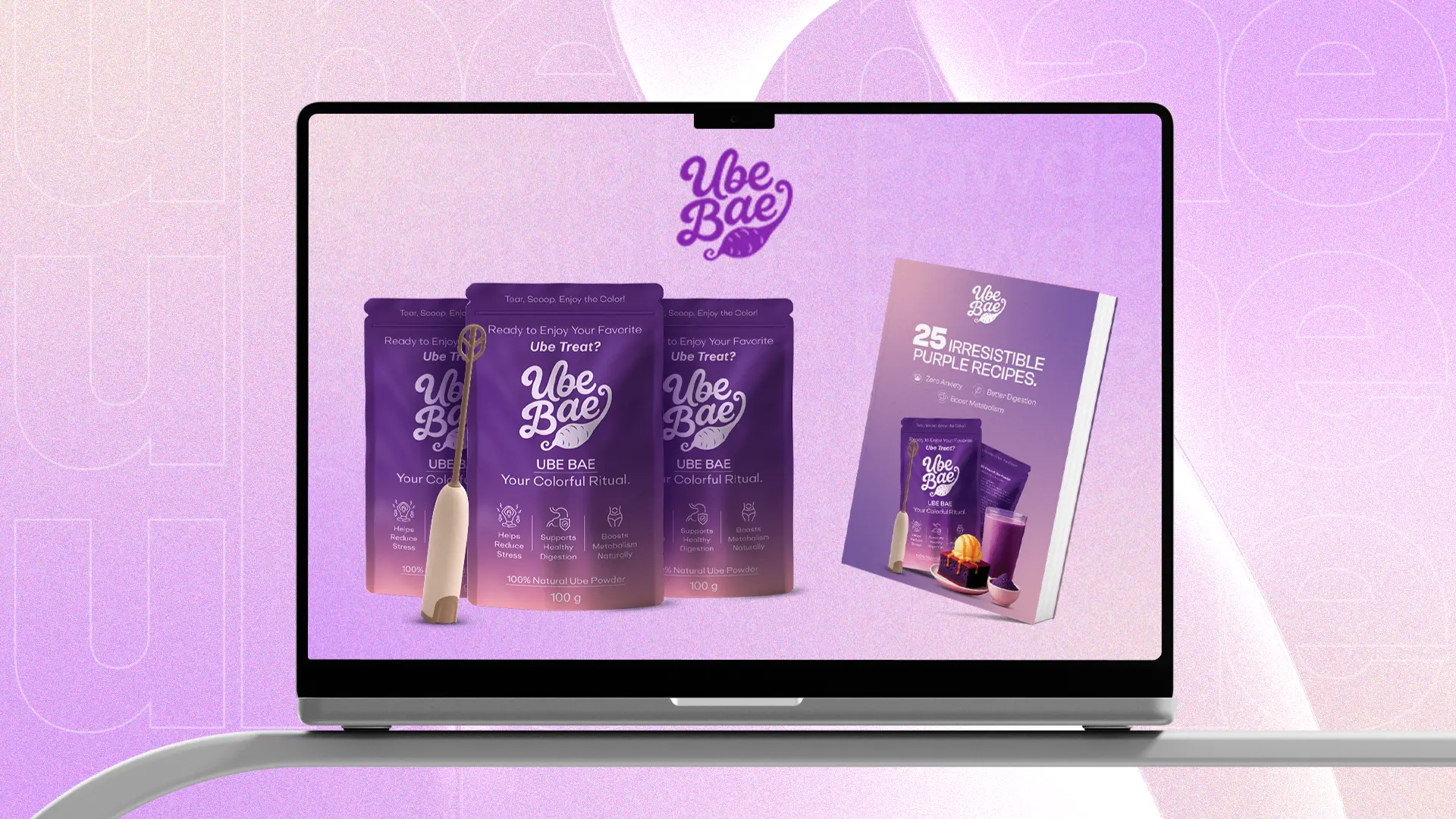
Results · Responsive Redesign
The Problem
A colorful product. A story that needed focus.
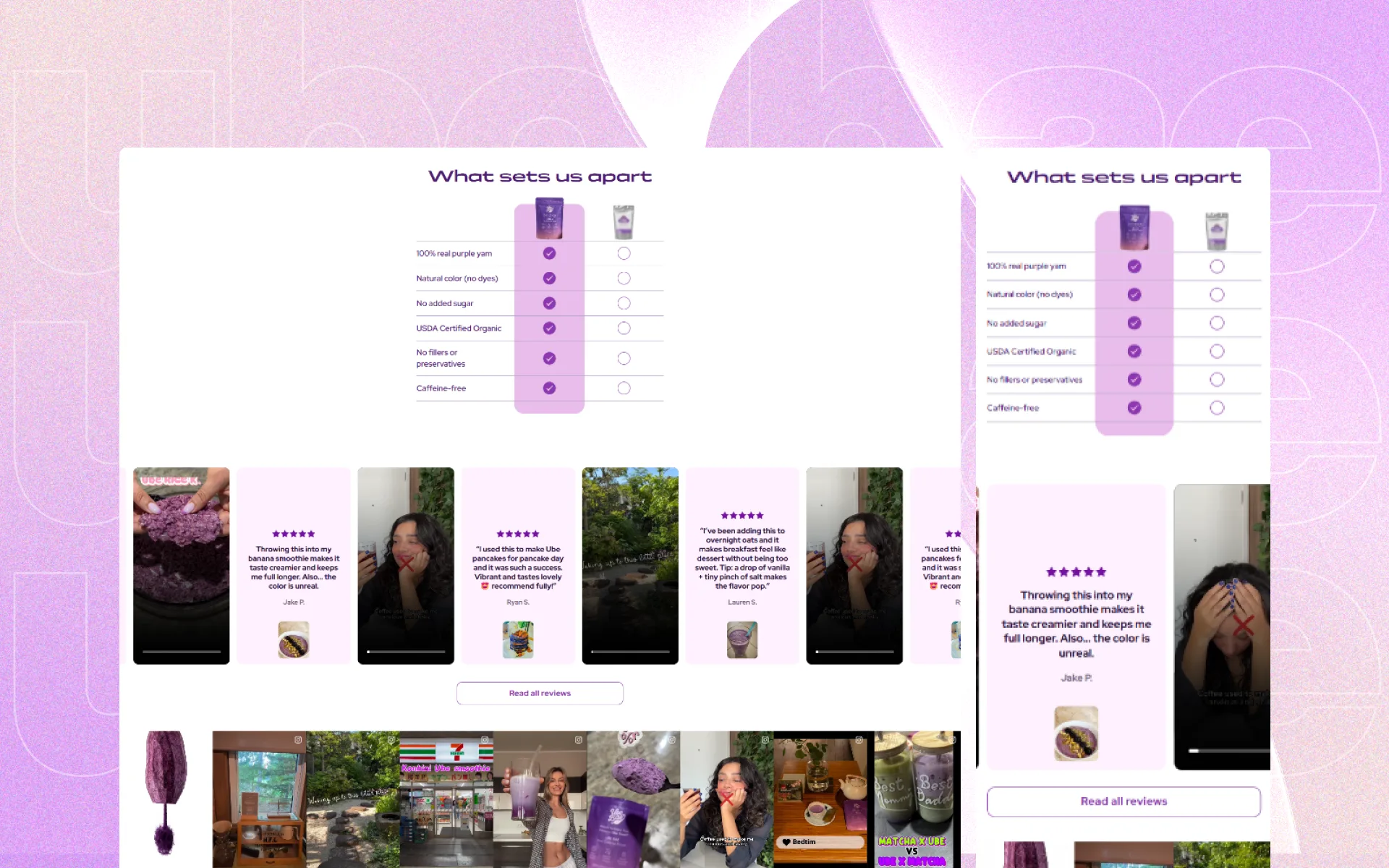
Ube Bae had a distinctive product and memorable visual identity, but the storefront needed to explain what ube is, why it matters, and how customers can use it. Education, recipes, social proof, and product benefits needed a clearer hierarchy without losing the energy of the brand.
The Solution
A vibrant journey built around discovery.
Clear Product Education
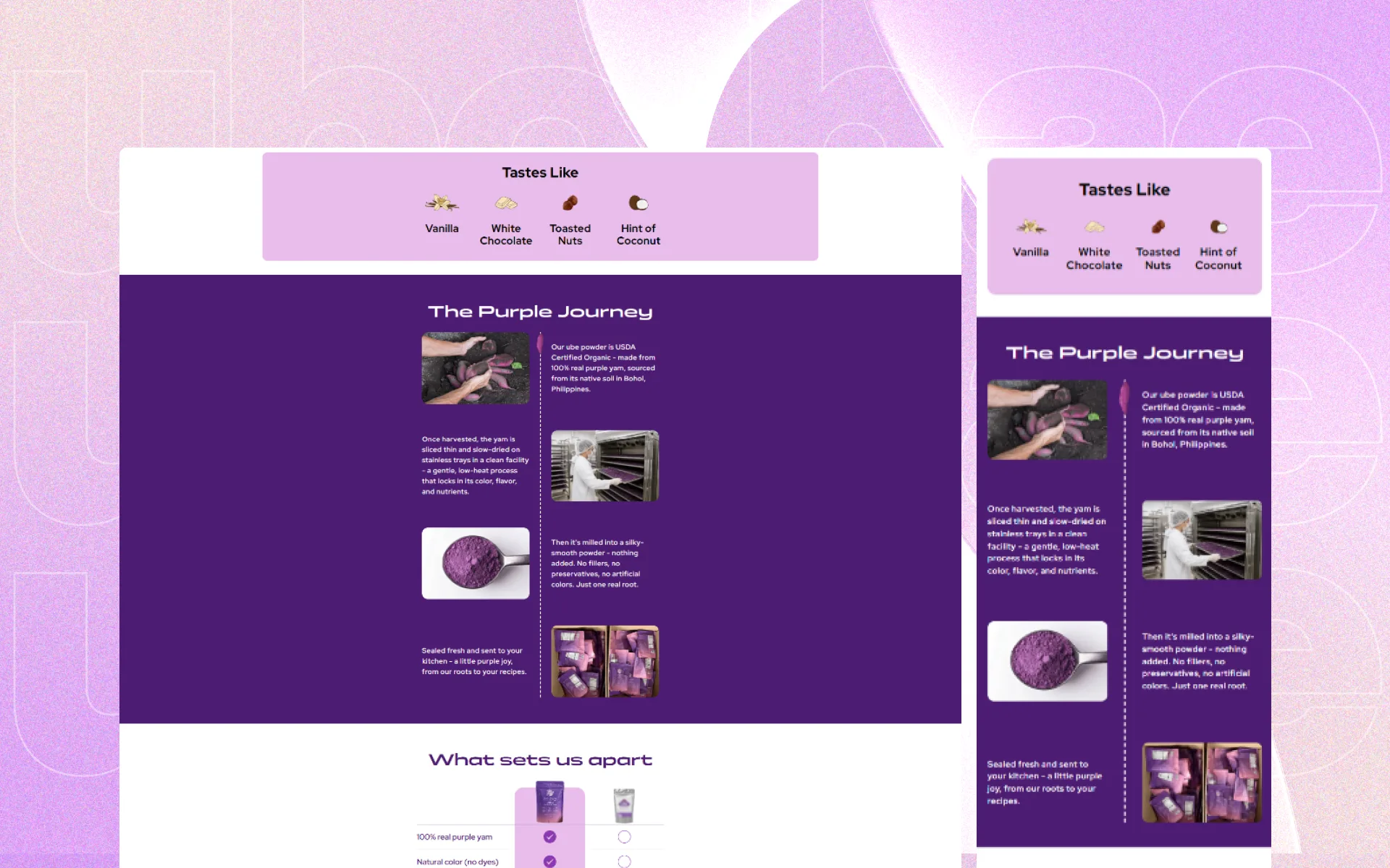
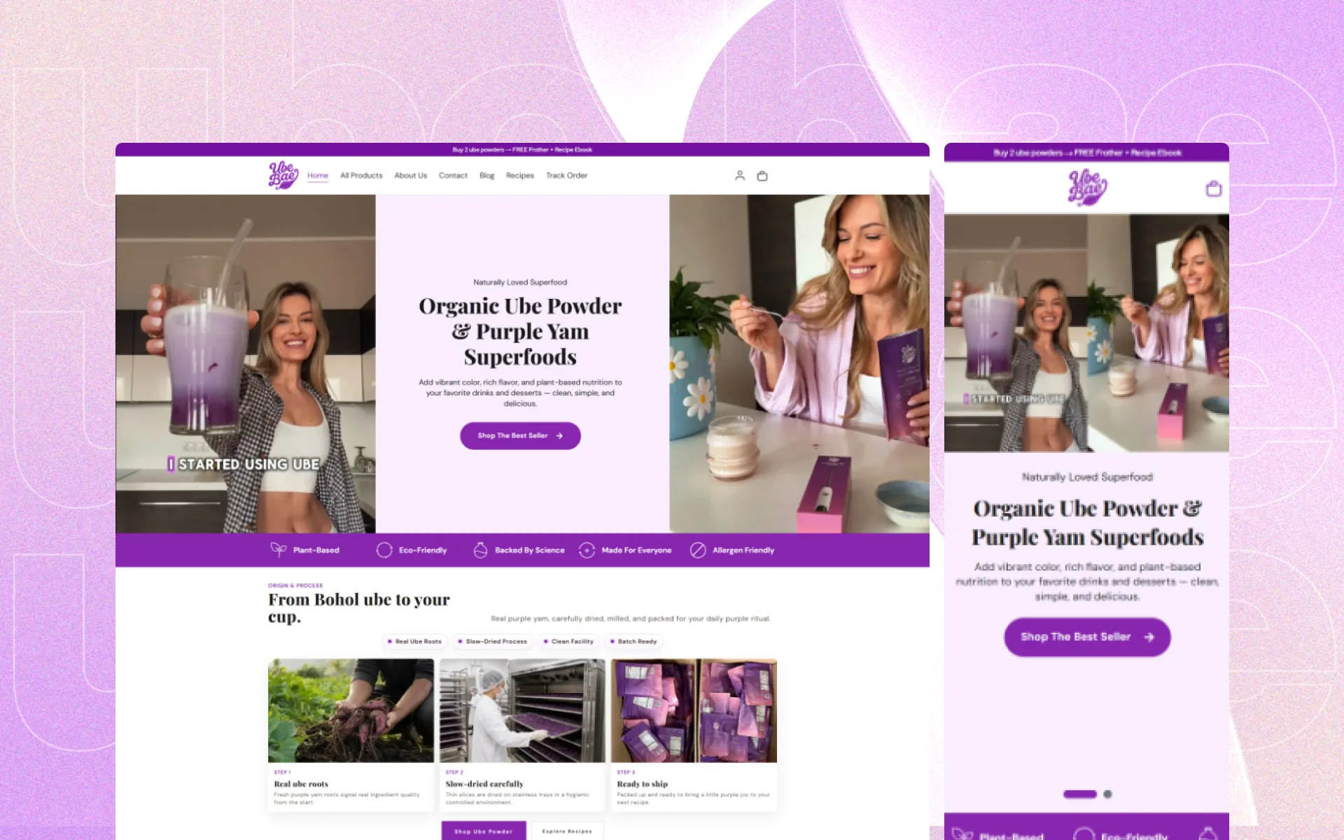
Origin, nutrition, preparation, and everyday uses were organized into short sections that make the unfamiliar product easier to understand.
Content to Commerce
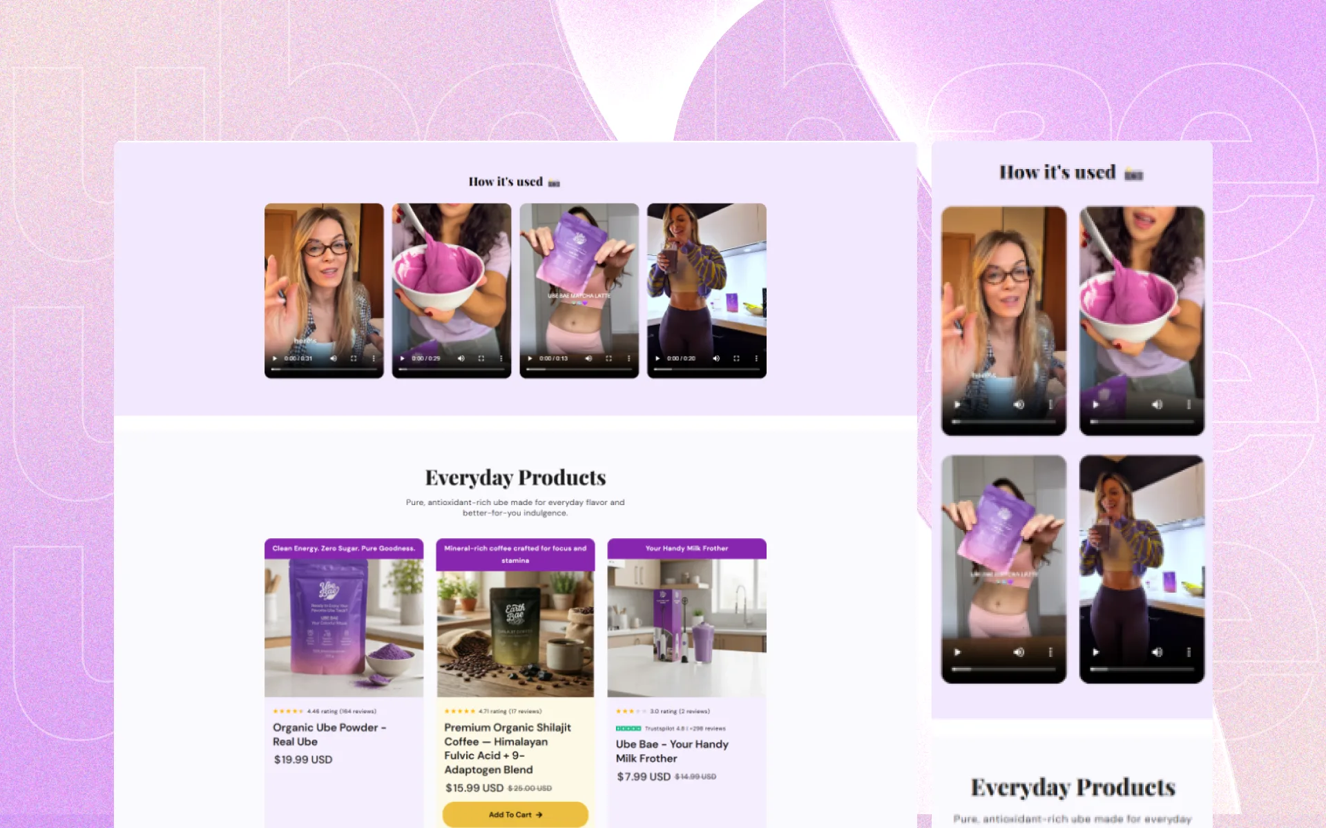
Recipes and serving inspiration were connected directly to product discovery so educational content could support confident purchase decisions.
Responsive Brand System
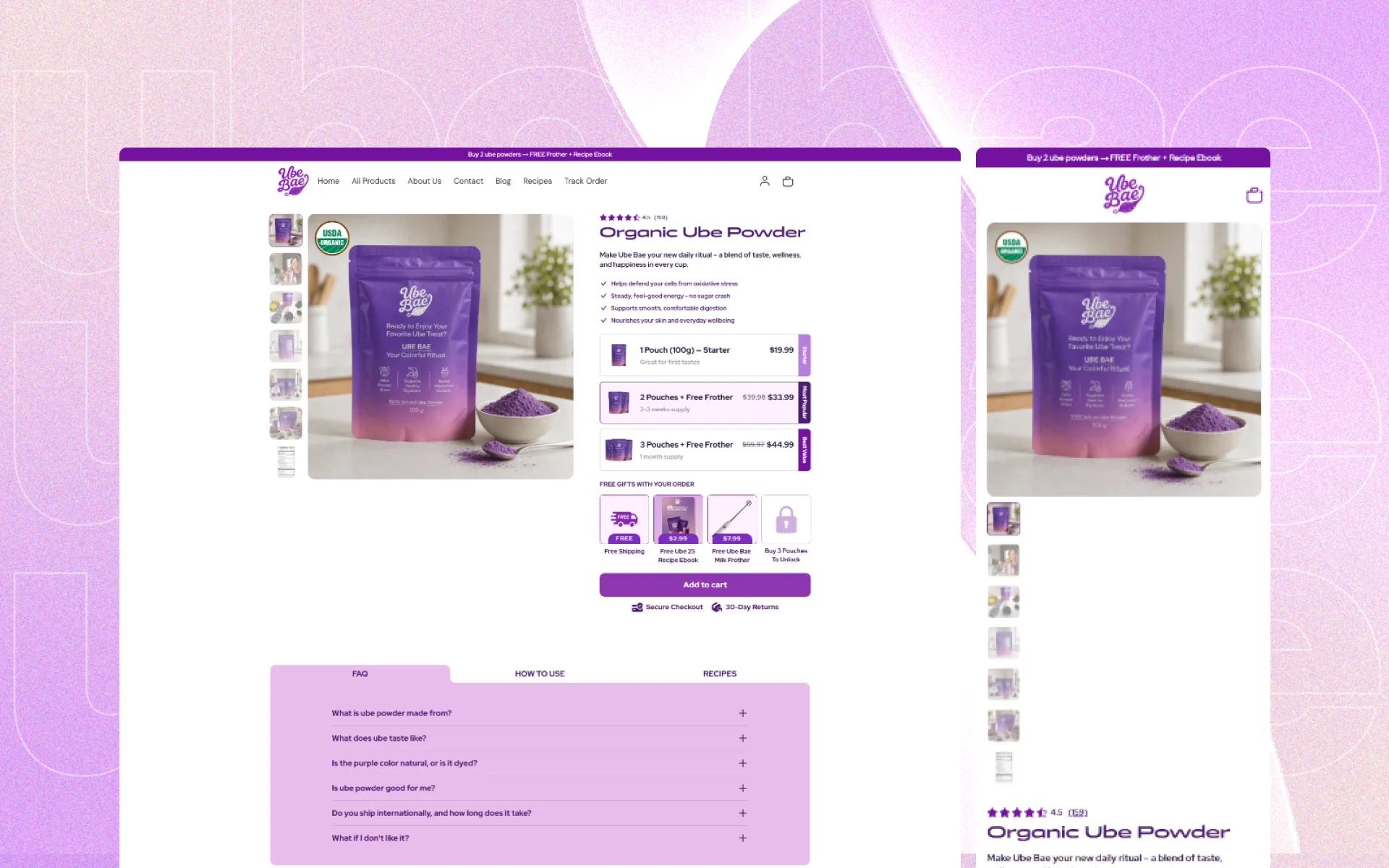
The purple visual language, product photography, and calls to action were adapted into layouts that remain focused and readable on every screen.
Some Highlights